As you work to create the perfect ad, you may find yourself wondering what type of imagery performs best on LinkedIn Ads. Though imagery isn’t the most important aspect of your LinkedIn Ads, it’s still something you want to get right.
To help you put together top-performing imagery that is well-suited to the platform, we’ve outlined some best practices below!
🔹 Image Size
Sponsored Content Ads on LinkedIn offer three different options for image size:
- 1200 x 628 (Horizontal/Landscape)
- 628 x 1200 (Vertical – Mobile Only)
- 1200 x 1200 (Square)
Out of the three, we recommend using square imagery for Sponsored Content Ads. Tests have shown that using square imagery resulted in a 15% higher clickthrough rate.
🔹 Billboard Rule
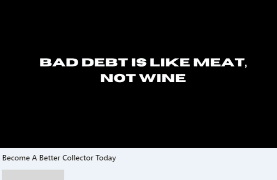
Your imagery should be concise and to the point.
People are already reading your ad copy, they don’t want to decipher a lengthy message in your image as well.
As a best practice, you can use text in your imagery, but keep it short and sweet.
The billboard rule is perfect – limit yourself to seven words or fewer.
This will make your ad much more digestible for the reader.

When creating advertising images for Sponsored Content, keep in mind that there is often not enough space to include a lot of text.
For other ad formats, such as Text Ads, the imagery is so small that text would not be readable anyway. In these cases, consider using a logo or the offer you are promoting as the subject of the image.
🔹 Image Color
Your image is not the only thing that converts on LinkedIn Ads.
The purpose of your image is to be an “eye-catcher” – to catch your audience’s attention enough that they stop scrolling and view your message.
This can often be accomplished through color.
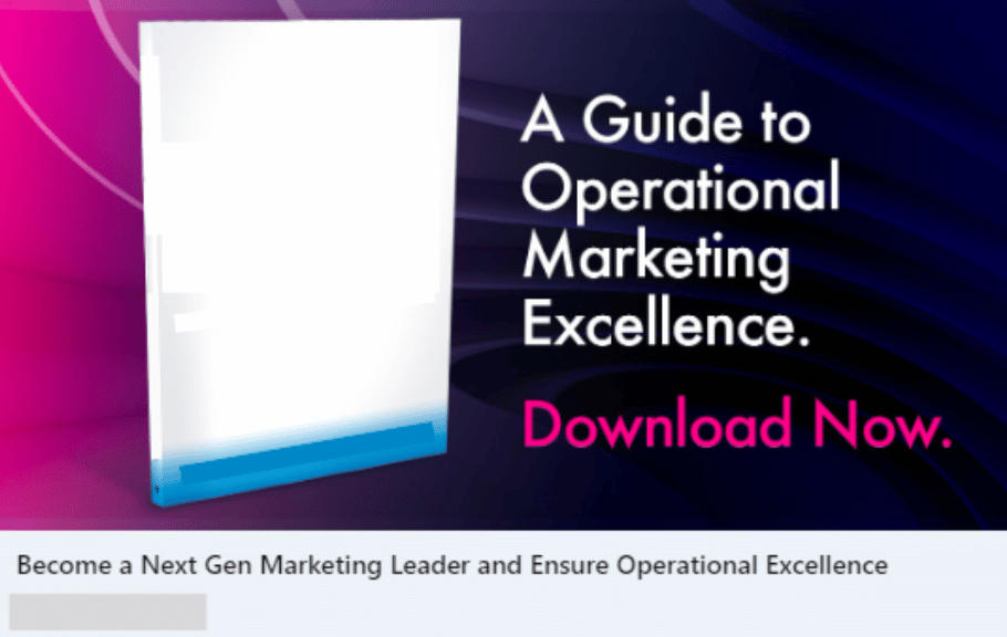
Use colors in your imagery that stand out against LinkedIn’s color scheme. Avoid colors like blue and white, instead use colors like oranges, greens, yellow, purples and reds.
For example, this ad stands out because it uses a mix of pink and purple, which contrasts well with the rest of the platform. Over the course of its run, this ad generated thousands of clicks at an average CTR of o.52%. It also generated a total of 2500 leads.

Though the success of this ad cannot be entirely attributed to its imagery, the image played a pivotal role in capturing the audience’s attention through contrasting colors.
🔹 Image Type
When creating images for LinkedIn Ads, it is important to consider what type of content will perform best.
Will a graphic, photo or text-based image be the most effective?
The key is to keep your target audience in mind when creating imagery, as this captures their attention and makes them want to read your full message.
Keep your ads professional and tailored to your audience for the best results.
🔹 Conclusion
Your LinkedIn Ads imagery may not be as important as your messaging, but it still plays a key role in driving ROI from your ads. Use these best practices to guide you as you create future LinkedIn Ads imagery.
Do you have questions about LinkedIn Ads? Check out how you can benchmark your LinkedIn Ads here.
Got more questions? Let’s connect.

